The owner of the apartment, who left a few months ago for Australia, called on young interior designer Laura García, to help transform the furnished rental apartment for the high-end market. Laura, with experience renovating luxury hotels and boutiques, had the skills required to breathe an air of modernity into her first furnished apartment project, using bold colours.
The result? An apartment that bursts with colour – one of our bestsellers!

Tell us about your background. Where might we have seen your work?
I was born in Bogota where I grew up and began my studies in product design. Then I moved to France to continue my studies in space design at the Ecole Boulle, where my passion for interior design became clear; it trained my eye.
Then I did a Masters specialising in marketing and communication at ESCP, and I was extremely lucky – my dream came true – to work for Andrée Putman with Olivia, his daughter. Recently, I worked for a major hotel group and in particular on a 4-star hotel project in Marseille.
I wanted to start doing my own projects and expressing my creativity for some time now, so I’m excited to share this one because it’s my very first apartment as an independent interior designer. My work is here: Maison Laurel.

What inspired you the most for the decoration of this apartment?
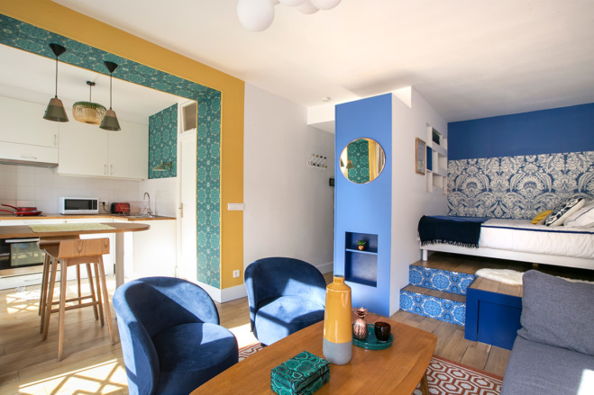
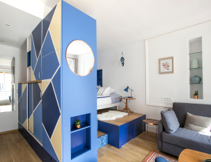
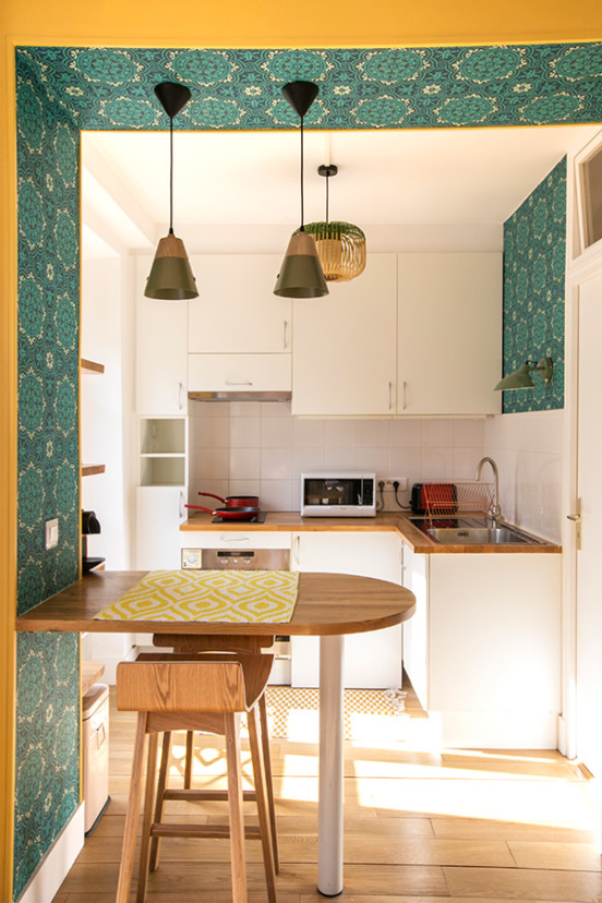
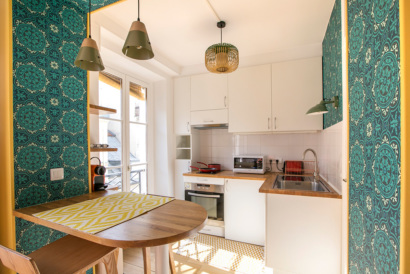
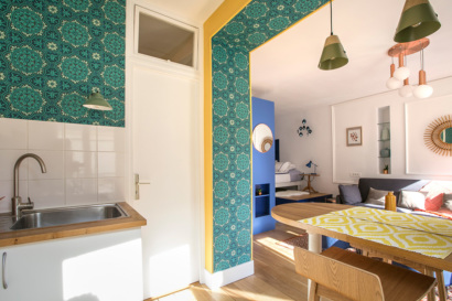
The theme for the inspiration for this apartment came from the owner, who wanted something evoking Santorini. So I developed a concept based on that theme, adding some touches here and there, and I called it “Lemonade in Santorini”. Then, since I was dealing with a typical small Parisian studio, I wanted to try a new zoning plan to distinguish each space, while maintaining complementarity among them, all the while keeping a harmonious and joyful atmosphere. I also had to adapt to the architecture, which had been done by an architect a few years previously, but I wanted to highlight certain spots such as the platform, the kitchen arch and the closets in the entryway; I wanted to enhance them because they were invisible until now.
What is your favourite colour?
Since I was very small, my favourite colour is definitely midnight blue or royal blue, which I also shared with Andrée Putman; that had an impact on me when I worked for her firm.
What colour palette did you work with for the decoration of this apartment?
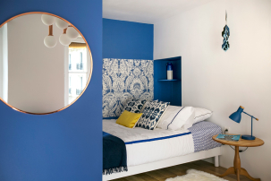
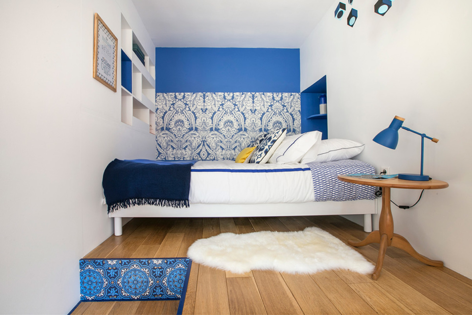
I was really happy to work with my favourite colour, blending it into a colour palette that corresponded to Santorini tones, white and blue, that I contrasted with the golden yellow, emerald green, and a few touches of orange softened with taupe and grey. I used different shades of blue for the sleeping area and the entryway. The blue tones and the yellow off-white on the closet doors in the entryway give an instant idea of the apartment’s atmosphere – joyful and relaxing – so it was perfect as a gentle transitioning area between the outside and the inside when you arrive home after a day at work. The blue and white tones highlighted with floral patterns for the sleeping area evoke a dreamy mood.

In the kitchen, I went for a blend of greens, emerald, khaki and pistachio, for the wallpaper and light fixtures. They create a cosy atmosphere, and the golden yellow brings a touch of warmth, happiness and awakens the appetite.
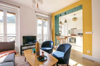
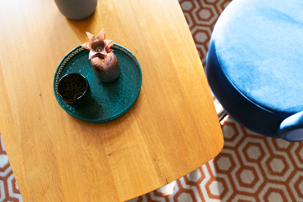
For the living area, I decided to keep it neutral with taupe and midnight blue for the furniture, and a hint of warmth with orange and the other colours already present in the apartment: yellow, emerald green and a few coppery dashes here and there. As I’m obsessed with mixing & matching, every single item in the apartment matches another in the same family, in colour and in material.
What are the current decorating trends?
At the moment, I think people are still very into the Scandinavian style, which I used myself for the furniture and the geometric shapes in the entryway. But there are also strong influences from the fashion world: velvet will make an appearance this winter; it is already popping up everywhere, in the design and fashion worlds. Shades of green – pistachio and emerald for example – and the presence of metals such as coppers, lacquered metals and also references to noble materials such as precious stones or marble, and particularly malachite, which I used in the little box on the living area coffee table. Petrol blue is also very popular at the moment.

Have you any decorating tips for us?
Personally, I love wallpaper but you have to be careful where you put it, because it can quickly become tired. I think it’s best to avoid wallpapering an entire wall, but rather “frame” specific walls to highlight them as a feature. This dresses the walls nicely and you don’t really need to hang paintings.
Without question, well-placed mirrors not only create the effect of a bigger space but they also reflect light.
In short, you just need to respect the space and sometimes you don’t even need to alter it. Place a bigger focus on some walls while choosing appropriate furniture and objects. And that will work magic!